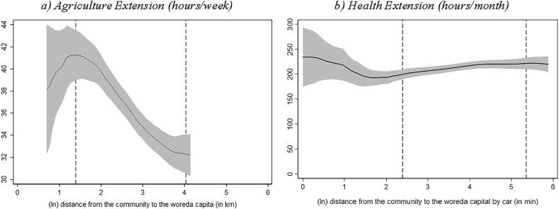
Fig. 2.
Reported working hours and distance to woreda capital Source: Authors’ calculation based on Digital Green’s DA survey, 2018 and Productive Safety Net Program (PSNP) survey, 2017. Note: Local polynomial regression. The vertical axis in graph a) measures the number of typical working hours per week reported by the agriculture extension worker. In graph b) the vertical axis measures the number of typical working hours per month reported by the health extension worker. The area between the dashed lines indicates the 90% of the distance distribution (between the kebele center and woreda capital). (For interpretation of the references to colour in this figure legend, the reader is referred to the web version of this article.)

