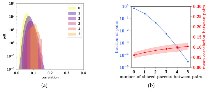
Figure 10.
(a) Another visualization of the correlation distribution of Figure 8, with , and , decomposed into the distribution for each number of shared parents. (b) Fraction of pairs of patterns (left y-axis, note the logarithmic scale) and mean correlation between those pairs (right y-axis, linear scale) as a function of number of shared parents. The red horizontal line corresponds to the average correlation with uncorrelated patterns distributed according to Equation (1). Pairs of patterns having more shared parents are markedly fewer, although on average more correlated, so they do not affect much the overall mean correlation.

