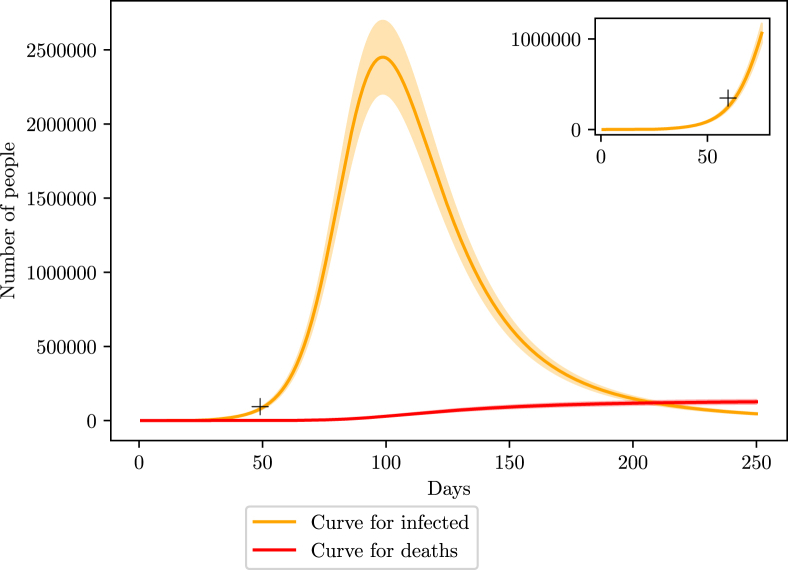
Fig. 8.
Simulation of the COVID-19 pandemic crisis in Brazil. Red curve shows the number of deaths caused by COVID-19 while orange curve represents the active number of infections. The shaded area represents the variation margin around the prediction. The smaller window on the top right corner shows an enlargement of the region close to the estimated number of infections described in section 3.

