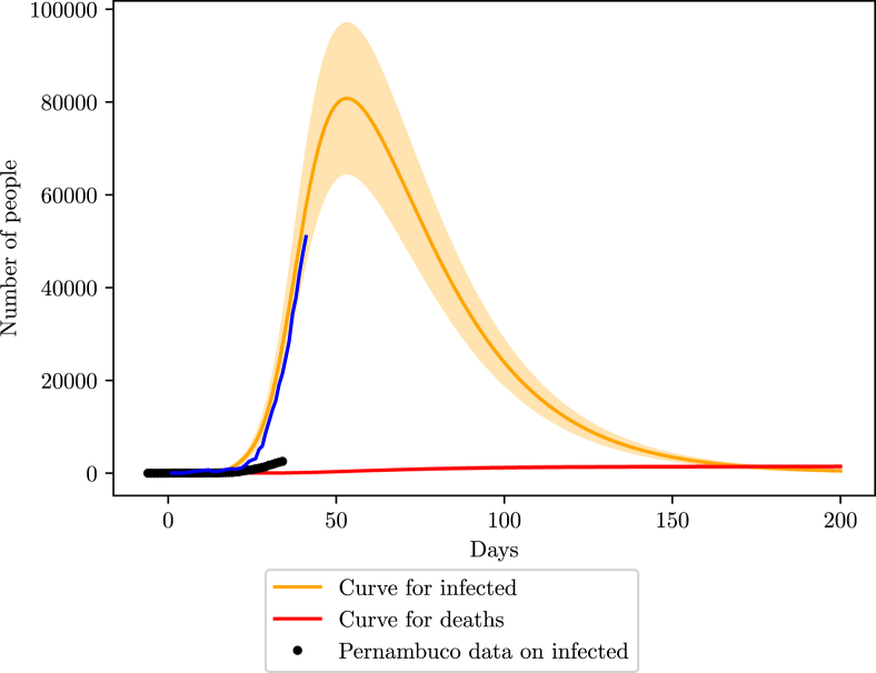
Fig. 9.
Simulation of the COVID-19 pandemic crisis in Pernambuco. The black dots are the reported number of active infections, done by subtracting the deaths and recoveries from the number of cumulative infections, the blue curve shows the behavior of the active infections data considering 90% loss of infections, that is, dividing the reported data by 0.1.

