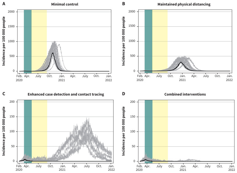
Figure 5:
Projected epidemic curves showing daily case incidence per 100 000 people for for the 4 scenarios with extended school closures. Note: Each scenario progressively applies increasing public health measures. The green bar represents the period from Mar. 16 to May 10, 2020, corresponding to restrictive closures. The yellow bar represents the period from May 11 to Sept. 8, 2020, corresponding to school closures only. Median values are represented by the black line. Each grey line represents 1 model realization out of 50 per scenario. The y-axis scale for the enhanced case detection and contact tracing scenario and the combined interventions scenario is 10 times smaller.

