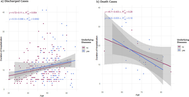
Fig 2. Duration of hospitalization vs age.
a) Duration of the hospitalization plotted vs Age, for the discharged group. Pink dots indicate the patients with underlying medical conditions and the blue dots indicate those without. There are two observations from this chart: 1. Elderly patients tend to have underlying diseases than the younger ones; 2. The duration of the hospitalization tends to be longer among the elderly patients. The straight lines and the shaded areas show the regression line and the 95% confidence interval. The parameter estimates as well as the adjusted R squared values were also indicated in the plots. b) Duration of the hospitalization plotted vs Age, for the death group. Pink dots indicate the patients with underlying medical conditions and the blue dots indicate those without. Elderly patients die more quickly than the younger ones. The straight lines and the shaded areas show the regression line and the 95% confidence interval. The parameter estimates as well as the adjusted R squared values were also indicated in the plots.

