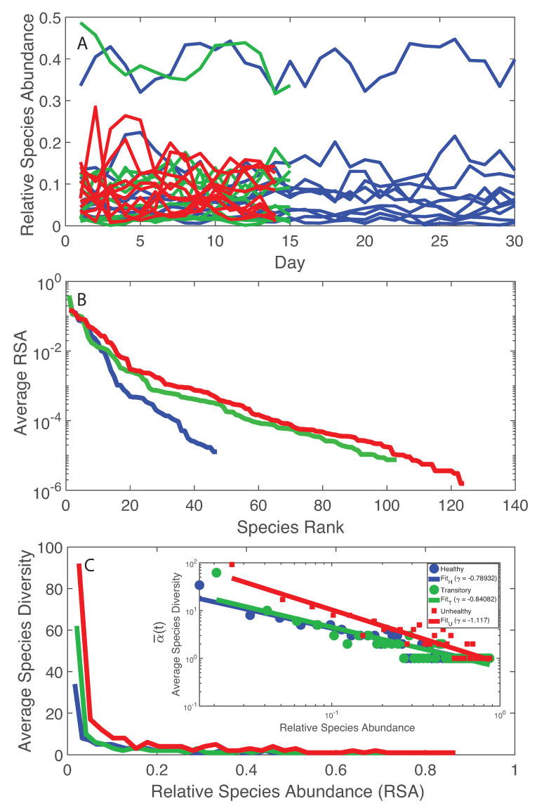
Figure 1.
RSA trajectories, RSA-rank, and Relative Species Abundance. Blue, green and red curves refer to the healthy, transitory and unhealthy microbiome, respectively. A: RSA time series for all individuals before LCM; B: average RSA-rank pattern; and C: average species diversity vs. RSA (the inset shows the same pattern in a loglog scale. The healthy microbiome shows smaller fluctuations in species diversity vs. RSA and one regime when considering the RSA-rank profile. An inverse scaling law was detected between the average species diversity and RSA (inset in C).

