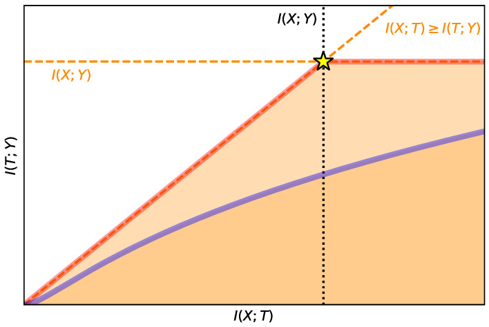
Figure A1.
Graphical representation of the IB curve in the information plane. Dashed lines in orange represent tight bounds confining the region (in light orange) of possible IB curves (delimited by the red line, also known as the Pareto frontier). Black dotted lines are informative values. In blue we show an example of a possible IB curve confining a region (in darker orange) of an IB curve that does not achieve the Pareto frontier. Finally, the yellow star represents the point where the representation keeps the same information about the input and the output.

