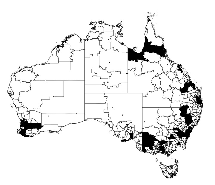
Figure 7.
Thresholded infection map of the Australian epidemic at the primary peak of infection of Figure 2. The regions in black represent SA2s with greater than average prevalence fraction , at time , whereas the regions in white show the areas with infection below this threshold.

