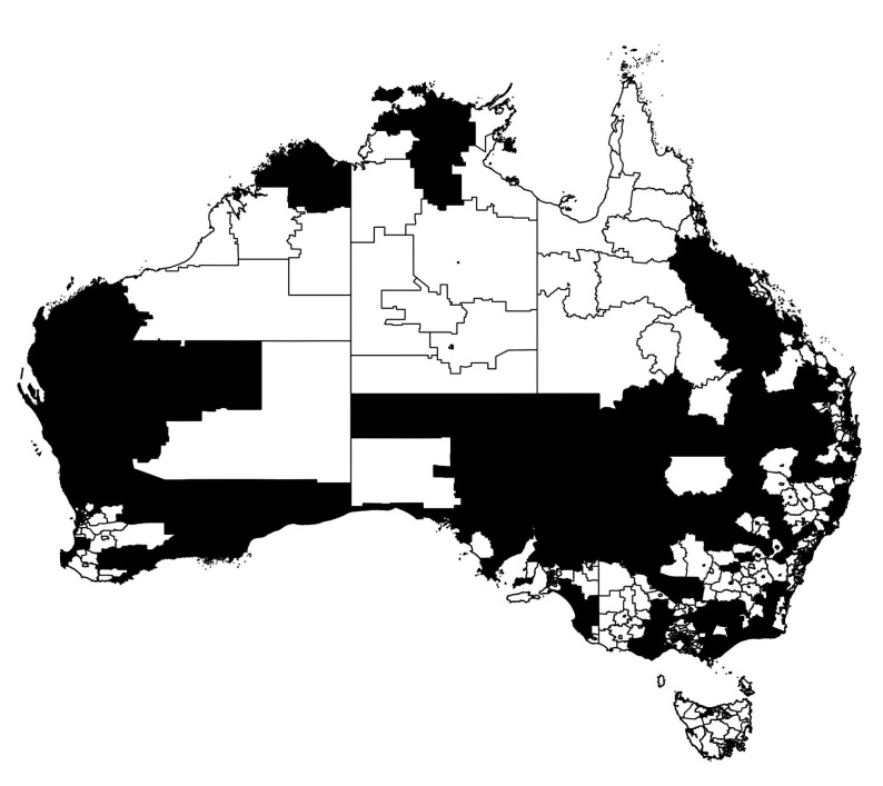
Figure 8.
Thresholded infection map of the Australian epidemic at the secondary peak of infection Figure 2. The regions in black represent SA2s with greater than average prevalence fraction at time , , whereas the regions in white show the areas with infection below this threshold.

