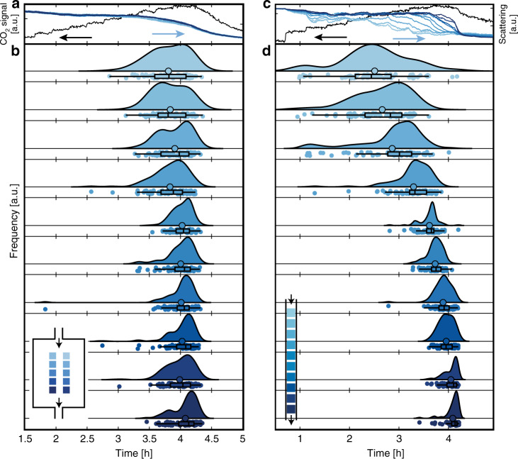
Fig. 8. Single Cu particle oxidation time analysis for the two reactors.
a CO2 production measured by the QMS at the outlet of the well-mixed reactor (black, left axis) together with the integrated scattering intensity for each of the ten patches (blue, right axis). b Oxidation times for the individual particles in the well-mixed reactor, presented as half violin plots. Each distribution corresponds to data collected from the 100 single particles contained within a patch, with each patch outlined and color-coded in the inset. Below each of the distributions are the individual particle data points presented as colored dots, the mean oxidation time (outlined large circle) and a box plot showing the median oxidation time, the inner percentile (box) and whiskers corresponding to the lower/upper adjacent values (horizontal line). c, d Same as (a, b) but for the plug-flow reactor. Note the slightly different scale on the x-axis.

