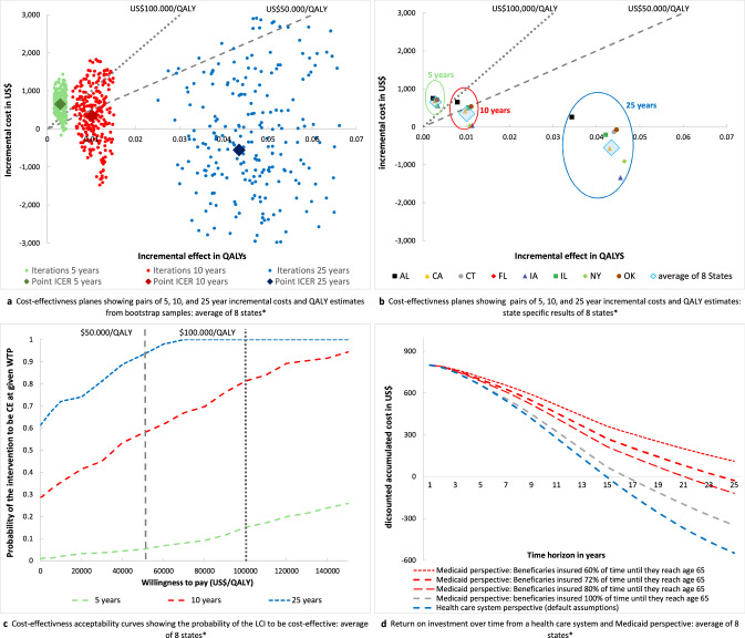
Fig. 1.
a Cost-effectiveness plane for the combined data of the eight study states with pairs of QALYs and cost estimates from n = 250 bootstrap samples. Green dots show bootstrap samples of pairs of QALYs and cost estimates over a 5-year time horizon, red dots show bootstrap samples over a 10-year time horizon, and blue dots show bootstrap samples over a 25-year time horizon. The large diamonds represent the mean of cost QALY and cost estimates. The gray dotted lines show the willingness to pay thresholds of US$50,000/QALY and US$100,000/QALY; realizations below these lines are considered to be cost-effective under the given willingness to pay threshold. b Cost-effectiveness plane with pairs of incremental QALYs and cost estimates for each of the eight study states. The large blue diamonds represent the pairs of population size-weighted incremental QALYs and cost estimates for the combined data of the eight study states (identical to 1a). The green circle frames the state-specific results of the analyses over a 5-year time horizon, the red circle frames the state-specific results of the analyses over a 10-year time horizon, and the blue circle frames the state-specific results of the analyses over a 25-year time horizon. The gray dotted lines show the willingness to pay thresholds of US$50,000/QALY and US$100,000/QALY; realizations below these lines are considered to be cost-effective under the given willingness to pay threshold. c Cost-effectiveness acceptability curves for the combined data of the eight study states with the WTP on the vertical axis and the probability of the intervention being cost-effective at a given WTP on the horizontal axis. Curves are derived on the basis of net benefit values from n = 250 bootstrap samples of incremental cost and QALY estimates. The green curve shows the 5-year time horizon, the red curve shows the 10-year time horizon, and the blue curve shows the 25-year time horizon. The gray dotted lines show the willingness to pay thresholds of US$50,000/QALY and US$100,000/QALY. d Curves of the per participant return on investment for the combined data of the eight study states with the time horizon on the horizontal axis and the accumulated costs on the vertical axis. The accumulated costs represent the value of upfront costs of US$800 for the intervention minus cost savings associated with prevention of diabetes and complications. The blue line represents the base-case scenario from a healthcare system perspective, the gray and red curves show the ROI from a Medicaid perspective assuming that beneficiaries are insured for 60–100% of their lifetime under Medicaid before they lose eligibility at age 65 years. Negative accumulated costs indicate a positive return on investment. * AL Alabama, CA California, CT Connecticut, FL Florida, IA Iowa, IL Illinois, NY New York, OK Oklahoma. LCI lifestyle change intervention, QALY quality adjusted life year, ICER incremental cost-effectiveness ratio, CE cost-effectiveness, WTP willingness to pay

