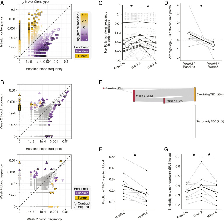
Fig. 5.
Dynamic peripheral changes in T cell clonotype frequencies. (A and B) Representative scatterplots (patient P16) showing the distribution of clonotypes between samples. (A) Baseline peripheral blood vs. tumor. Colors indicate the relative frequency in the tumor (orange) or baseline blood (purple); sample enriched clonotypes are filled squares, left of the vertical line are novel tumor clonotypes. (B) Comparisons between longitudinal peripheral blood samples. The up-triangle indicates expansion, the down-triangle indicates contraction, and color indicates sample enrichment. (C) Frequency of the top-10 most abundant tumor clones in peripheral blood. Black lines indicate representative clones per patient. (D) Average fold change per patient of the clones shown in C. Diamonds and the black line track the mean. (E) Representative Sankey plot (patient P6) showing emergence and detectability of TECs in peripheral blood samples. (F) Line graph showing percentage of TECs detected in postradiation patient blood. Diamonds and the black line track the mean. (G) Baroni-Urbani and Buser index showing the degree of patient blood sample similarity to patient tumor. Diamonds and the black line track the mean. *P < 0.05, Mann–Whitney–Wilcoxon paired two-tailed test.

