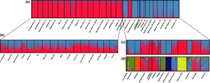
FIGURE 4.

STRUCTURE plots for microsatellite data, where each vertical bar represents an individual, and the colors of the bar represent what proportion of each individual's ancestry is attributable to each of the K theoretical genetic clusters. (a) Full dataset (K = 2, most likely), (b) Florida K = 2 showing the high amount of admixture in Florida populations (K = 1 is most likely), (c) southern California (K = 2, most likely), and (d) southern California (K = 5). While this method cannot distinguish any of the Florida populations, it can differentiate between many of the southern California populations
