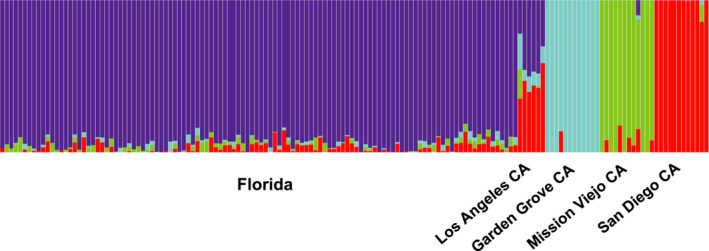
FIGURE 5.

Admixture plot using SNP dataset. The fraction of each vertical bar assigned to each color represents the proportion of that individual's ancestry attributable to each of the K theoretical genetic clusters. K = 4 was selected as most likely by the CV error method provided in program's literature
