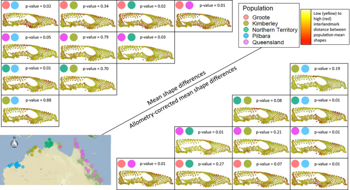
Figure 2.

Pairwise comparisons between means of each population and visualization of interlandmark variation between populations mean shapes. Warmer colours represent higher landmark variation. Top left, comparisons between mean shapes of each population; bottom right, comparisons between size‐corrected mean shapes of each population. Map on bottom left shows all specimen locations used in this study. P values for pairwise comparisons are corrected with the Bonferroni method. Note that the colour range in this figure is calculated within the minimum and maximum inter‐landmark differences between population comparisons and is therefore not comparable to the colour range of Figure 1. Using the same colour range would mask the population differences depicted here. Also note that black vectors of direction and magnitude of variation (these are comparable to Figure 1) are barely visible because the shape differences are very small
