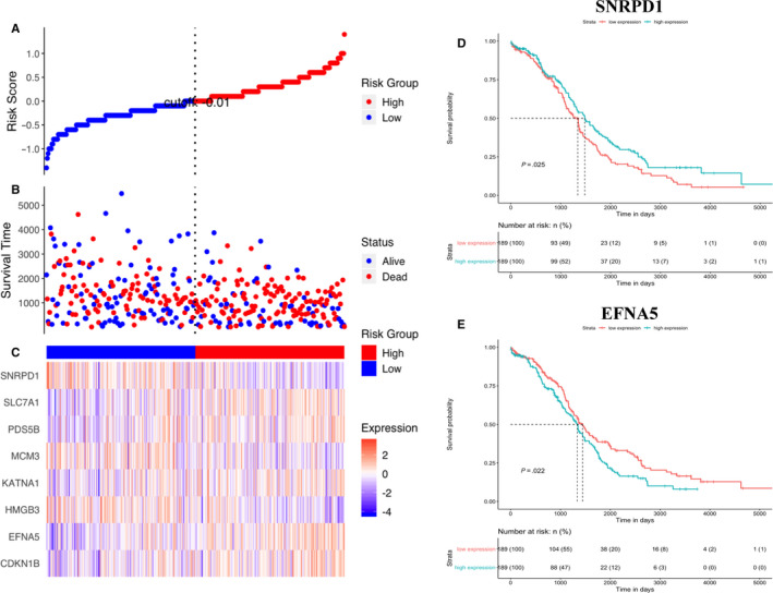
FIGURE 6.

The correlation between signature gene expression and survival outcome of patients. A, Scatterplot depicts the distribution of risk scores. Each red dot indicates one high‐risk patient, and each blue dot indicates one low‐risk patient. B, Survival time distribution classified by status. C, Heatmap of gene expression. D, KM survival curve (high SNRPD1 expression vs low SNRPD1 expression patients) for overall survival. E, KM survival curve (high EFNA5 expression vs low EFNA5 expression patients) for overall survival
