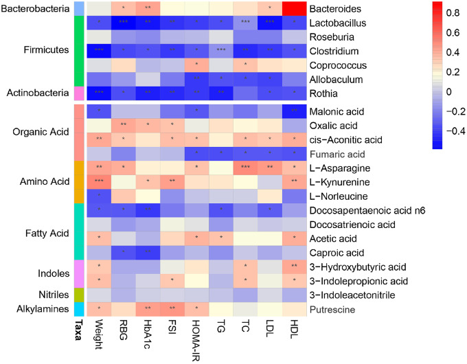
Figure 6.
Association map of the three-tiered analyses integrating the gut microbiome, phenotypes, and metabolome. The left side of the panel showed associations between gut microbiota and phenotypes. The right side of the panel showed associations between metabolites and phenotypes. The intensity of the colors represented the degree of association (red, positive correlation; blue, negative correlation). *P < 0.05, **P < 0.01, ***P < 0.001.

