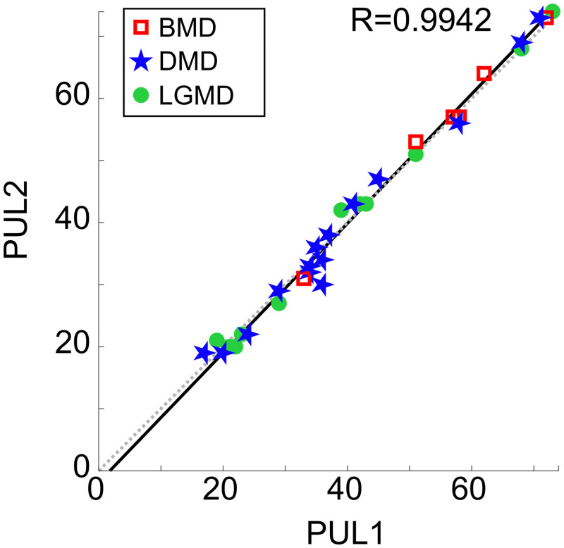
Fig 2. Correlation of PUL scores from two assessors.
Each data point represents the PUL score of one patient (N = 32), on the x-axis the scores assigned during the test (PUL1), and on the y-axis the scores assigned during the retest (PUL2). Red squares (N = 6), blue stars (N = 15), and green dots (N = 11) are the PUL scores of BMD, DMD, and LGMD patients, respectively. The solid black line represents the linear regression fitting the PUL data points, while the dashed grey line represents the ideal correlation (y = x). Pearson’s r value is 0.9942.

