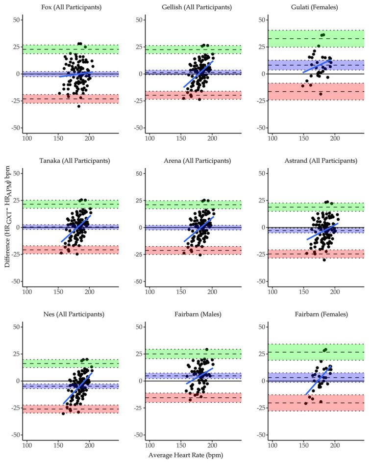
Figure 1.
Bland-Altman plots showing agreement between measured and predicted HRmax. The vertical axes represent the difference in heart rate (bpm) between HRmax during GXT and HRmax as predicted by each equation. The horizontal axes represent the mathematical average for each participants HRmax measurements. The middle dashed line represents bias, while the upper and lower dashed lines represent the upper (+2SD) and lower (−2SD) limits of agreement. The dotted lines surrounding each dashed line represent the confidence intervals of the bias (middle), upper, and lower levels of agreement.

