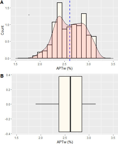
Figure 6.

Histogram of the contrast enhancing rim. The histogram was computed with the statistical programming language “R v3.6.1” in the “R Studio” environment in combination with the packages “ggplot2”” and “cowplot”. Figure 6A shows the histogram with an overlaid density plot in red. The mean is depicted as a dashed blue line. It presents a double peak with APT values at 2.4% and 2.9% Figure 6B shows a boxplot of the data with the median as a prominent black line in the middle and the 25th and 75th percentile as the outer borders of the box. APT, amide proton transfer.
