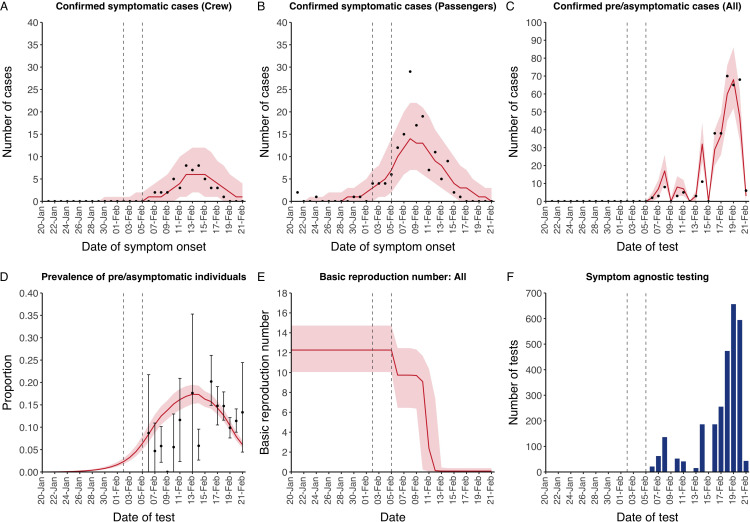
Appendix 2—figure 4. Data from the Diamond Princess and model calibration.
Figure shows data from the Diamond Princess (points (A–D) and bars (F)) and results from model calibration. Red lines = median, shading = 95% posterior plus observational interval (A–C) and 95% posterior interval only (D–E). Two vertical lines show the date of the first confirmed diagnosis (left) and the start of quarantine measures (right). (A–B) show confirmed symptomatic cases among crew (A) and passengers (B) with a reported date of onset; (C) shows confirmed pre- or asymptomatic individuals by test date; (D) shows the prevalence of pre/asymptomatic individuals by test date. Points and error bars show point estimates and 95% confidence intervals; (E) shows the basic reproduction number over time for the ship as a whole, reflecting the drop in contact rates (F) shows the number of tests administered irrespective of symptoms, by test date.

