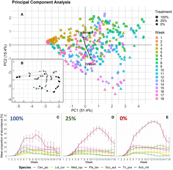
Figure 2.
Changes in plant species abundance over time per treatment. (A) Principal component analysis based on species abundance data. One data point represents one EcoUnit of the iDiv Ecotron observed in 1 week (n = 431). The community development over time (18 weeks) is indicated by a color gradient representing the week. Eigenvalues are given in percent and represent the explained variance according to the axes. The treatments are represented by filled symbols (square = 100%, triangle = 25%, circle = 0%). Variables week and treatment are post-hoc correlated (p < 0.001). Arrows are enlarged in scale by the factor two to fit the scale of the plot. Their lengths show differences in explained variance relative to each other. (B) PCA-centroids per week and treatment. The dashed lines connect the symbols that represent the plant community abundance development over time. (C, D) Plant species-specific changes in abundance over time as given by mean proportion of percentage values with standard error. Each invertebrate treatment is represented by a panel: (C) 100%-treatment, (D) 25%-treatment, and (E) 0%-treatment. The seven plant species are color-coded. Species abbreviations are listed in Table 1 .

