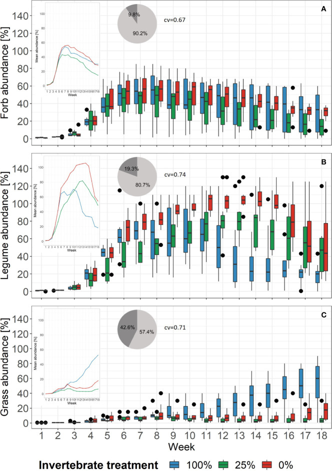
Figure 3.
Changes of the proportion of abundance of plant functional groups in each treatment over time. Black dots mark outliers. Small windows give the mean proportion of abundance of the same functional group as lines. Pie charts show the relative importance based on boosted regression trees of the variables week (light grey) and treatment (dark grey). Right beside it, the cross-validation correlation of the models is given (cv). See Supplementary Figure 8 for partial dependence plots. (A) Forb abundance, (B) Legume abundance, (C) Grass abundance.

