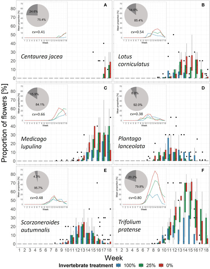
Figure 5.
Changes in the proportion of flowers of the six plant species in each treatment over time. Black dots mark outliers. Small windows give the mean proportion of the same species within the community as lines. Pie charts show the relative importance based on boosted regression trees of the variables week (light grey) and treatment (dark grey). Underneath the pie chart the cross-validation of the models is given (cv). See Supplementary Figure 7 for partial dependence plots. (A) Centaurea jacea, (B) Lotus corniculatus, (C) Medicago lupulina, (D) Plantago lanceolata, (E) Scorzoneroides autumnalis, (F) Trifolium pratense.

