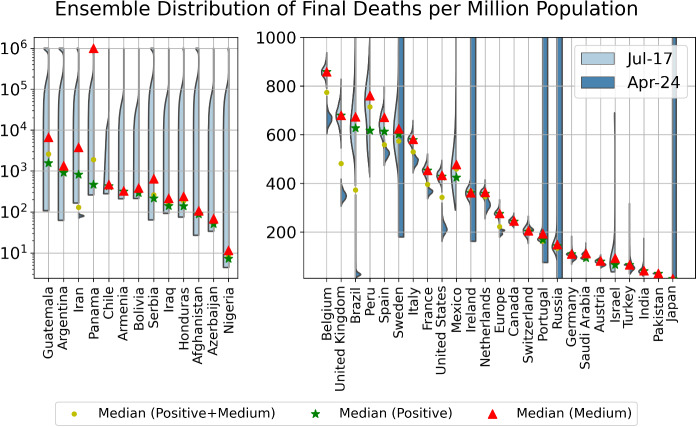
Fig. 9.
Violin plot of the distributions of the final total number of deaths per million derived by combining the distributions of the positive and medium scenarios. The left side of each violin in cyan is based on data up to July 17, while the right side of each violin in grey is based on data up to April 24, when the first version of this paper submitted. The left panel shows countries that have a distribution that has not converged, and the right panel presents countries that have converged. The model setup in the negative scenario does not incorporate a maximum saturation number and thus cannot be used. The yellow dots indicate the median prediction for the combined distribution, while the green and red dots indicate the median of the positive and of the medium scenarios, respectively

