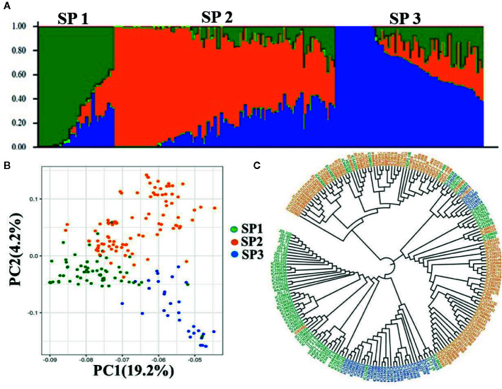
Figure 2.
Population structure, PCA, and NJ tree of wheat association mapping panel (A). Population Structure. Bar graphs for three subpopulations are indicated by different colors. The vertical coordinates of each subpopulation indicate the membership coefficient for each individual, and the digits on the horizontal coordinates represent the corresponding genotypes corresponding to the table. In each subpopulation, each vertical bar represents one genotype. STRUCTUREv2.3.4 (https://web.stanford.edu/group/pritchardlab/structure_software/release_versions/v2.3.4/html/structure.html). (B) PCA ggplot2 R program (https://cran.r-project.org/web/packages/ggplot2/citation.html) and (C) NJ tree.

