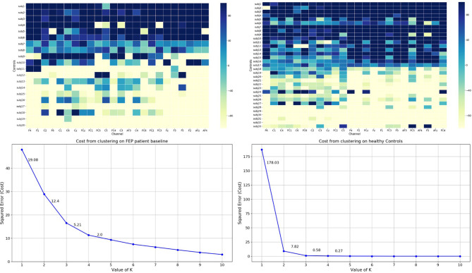
Figure 4.
Top: Grand average of individual’s AverageDifference of delta frequency in healthy Control (Right) and FEP patient baseline (Left) across 24 channels. X axis: electrode sites; Y axis (far left): individual participants; Y axis (far right): the magnitude of the AverageDifference values. Bottom: The elbow method plots. X-axis: number of clusters; Y-axis: error/cost function. The cost (error) value drop is shown for each cluster solution.

