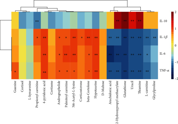
Figure 6.

The Spearman correlation analysis among cytokines and biomarkers, and clustering is shown as a heat map. Color from red to blue indicates a positive correlation to a negative correlation, and the asterisk represents the significance of the correlation, ∗P < 0.05, ∗∗P < 0.01.
