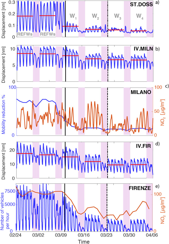
Figure 3.
(a, b, d) Time series of the noise amplitude (in nm) in the frequency band between 5 and 20 Hz as obtained from the PPSD analysis. Red horizontal lines represents the average noise level for each working week. Continuous black vertical line mark the lockdown date (DPCM-1) while the following dashed one refers to the closure of all commercial activities (DPCM-2). Light purple vertical bands highlight the weekend. In (a) in light gray we indicate the reference time window represented by the 2 weeks preceding the lockdown (REFWs) and the following four weeks (W1–W4). In (c) we show using blue and orange lines, mobility reduction and NO2 level respectively as recorded at Milano. In (e) the number of vehicles per hour (blue line) and NO2 level (orange line) for Firenze are shown. Further details could be found in section “Results”.

