
Figure 4.
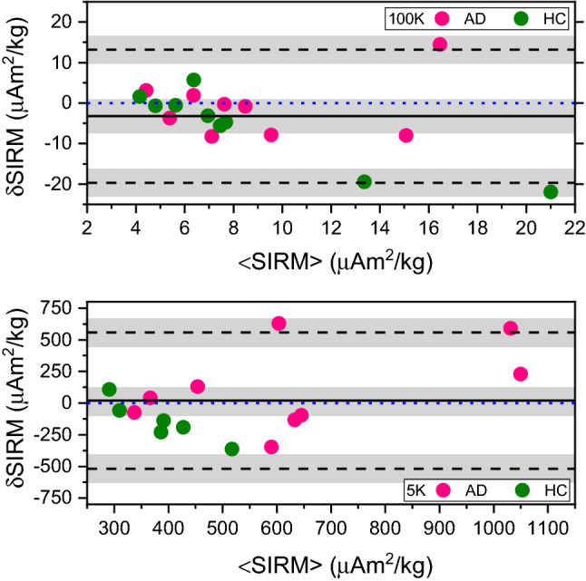
Bland–Altman plot of the difference in SIRM values before and after fixation. Differences in SIRM values (SIRM) obtained at 100 K (top row) and at 5 K (bottom row) are plotted against mean SIRM values (<SIRM>). The solid line represents the bias, while the dashed black lines represent the limits of agreement. The blue-dotted line represents the line of equality. The gray rectangles present confidence interval limits for mean and agreement limits. The green color is used for the healthy controls (HC) and pink is used for the Alzheimer’s cases (AD). Linear regression was used to exclude for proportionality bias. At the 5% level, the data slope was not different from zero.