. 2020 Sep 14;9:e57067. doi: 10.7554/eLife.57067

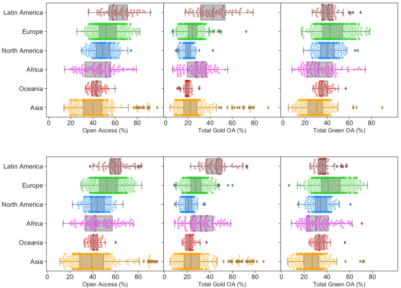
Figure 2. Open access performance of different geographical regions.

Percentages of institutional Total OA, Gold OA and Green OA (left to right) grouped by regions for 2017. Parallel figures for 2016 and 2018 are provided in Figure 2—figure supplement 1.

Figure 2.

Figure 2—figure supplement 1. Open access performance of different regions in 2016 and 2018.

Figure 2—figure supplement 1.

Percentages of institutional Total OA, Gold OA and Green OA (left to right) grouped by regions for 2016 and 2018, respectively.
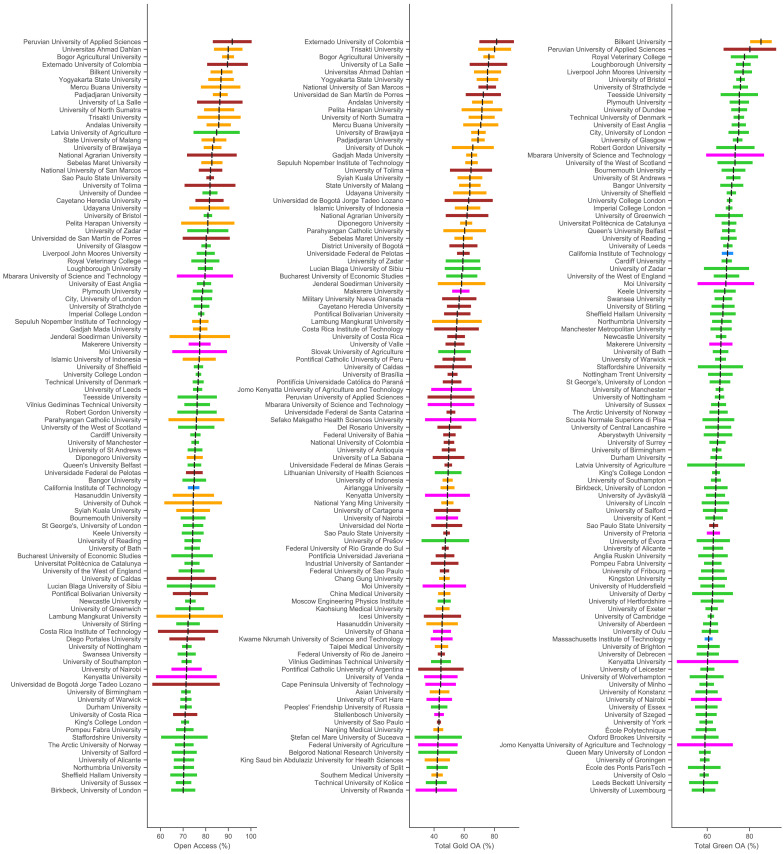
Figure 2—figure supplement 2. Top 100 universities in terms of performance in total open access, publisher-mediated open access (gold OA) and repository-mediated open access (green OA) for 2017.

Figure 2—figure supplement 2.

The black lines represent the OA% as calculated from the data. The colour bars are 95% confidence intervals calculated with Šidák correction to compensate for the multiple comparisons effect. The colours represent the regions as per Figure 2. Evidently, universities topping this list achieve around 80–90% OA.
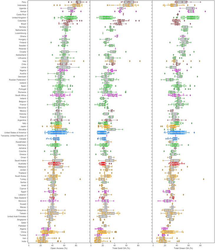
Figure 2—figure supplement 3. Percentage of institutional Total OA, Gold OA and Green OA (left to right) grouped by country for 2017.

Figure 2—figure supplement 3.

The colours represent the regions as in Figure 2. The overlaid boxplots exclude outliers as determined using the standard interquartile methods (i.e. values more than 1.5 interquartile range away from the first or third quartile are deemed outliers). Countries are ordered by their median Total OA% (left panel). This figure includes small universities (those with significantly fewer research outputs) which are left out of the main article.