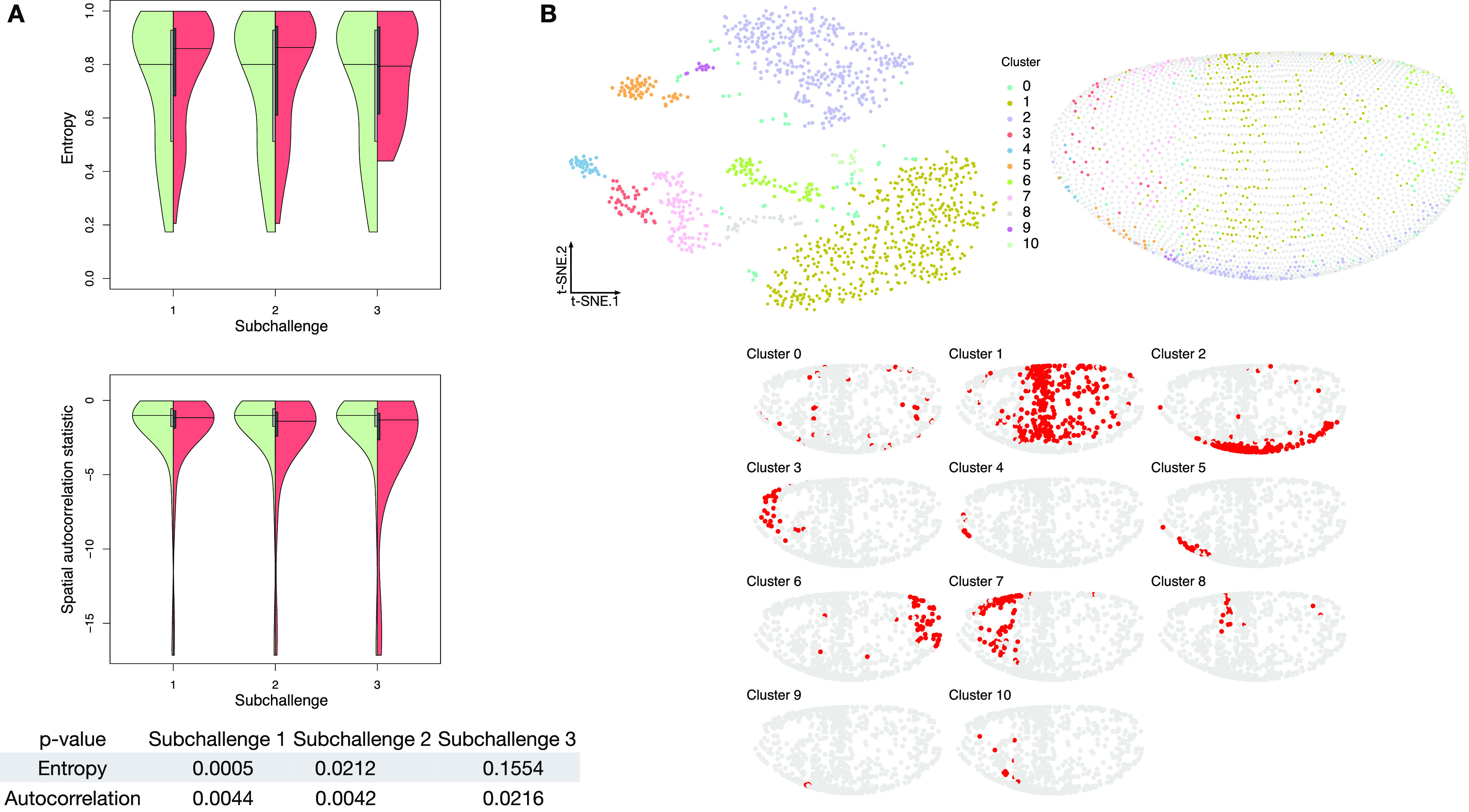
Figure 3. Properties of selected genes.

(A) Double violin plots of the distribution of entropy and spatial autocorrelation statistic of (left, green) all in situs calculated on all embryonic location bins and (right, red) the most frequently selected 60, 40, and 20 genes in the respective subchallenges. Bottom table: P-values of a one-sided Mann–Whitney U test of location shift comparing the selected (red part of the violin plot) genes versus the non-selected genes (green part of the violin plot). (B) Top left: visualization of the transcriptomics data containing only the most frequently selected 60 genes from subchallenge 1 by the top-performing teams (embedding to 2D by t-SNE). Each point (cell) is filled with the color of the cluster that it belongs to (density-based clustering with DBSCAN). Top right: spatial mapping of the cells in the Drosophila embryo as assigned by DistMap using only the 60 most frequently selected genes from subchallenge 1. The color of each point corresponds to the color of the cluster from the t-SNE visualization. Bottom: highlighted (red) location mapping of cells in the Drosophila embryo for each cluster separately.
