FIGURE 2.

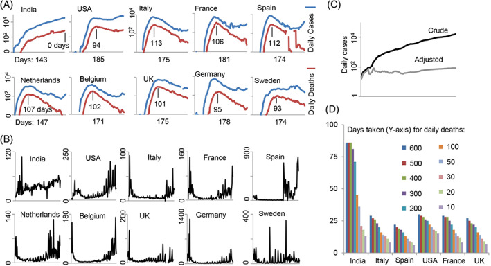
A comparison of COVID‐19 morbidity and mortality data for India and nine other developed countries. A, Number of daily cases (blue line; 7‐day moving average) is plotted along with the daily deaths (red line; 7‐day moving average) reported due to COVID‐19. The day of the first reported case of COVID‐19 in each country was selected as the initial data point and deaths and cases until Jul 24, 2020 are shown. The number of days shown below the X‐axis indicates the total number of days past since the first recorded case. The number of days shown above the X‐axis indicates the number of days past the peak in daily deaths based on a 7‐day moving average. B, Number of daily cases (7‐day moving average) was divided by the number of daily deaths and plotted. The initial part of the curve for almost all countries except India shows a “head” and the later part a “tail”. C, The actual daily cases (dark line) show an increasing trend but when it was normalized for the number of tests done during this period (Mar 20, 2020‐Jul 18, 2020) the curve loses its slope (gray line); note: the adjusted curve may not show actual daily death numbers, but is only shown to compare the slopes of the curves. D, Time in days each country took to reach the first 10, 20, etc. deaths. The data on daily testing, daily cases, and daily deaths were obtained from ourworldindata.org
