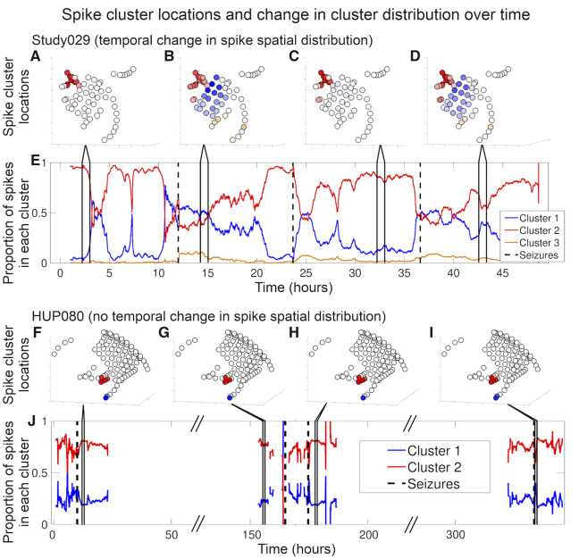
Figure 2.
Spike location and cluster distribution over time. Patient Study029 (A–E) demonstrated a significant change in cluster distribution over time and Patient HUP080 (F–J) did not. (A–D and F–I) Diagrams of each patient’s electrodes and the average spike frequency in each electrode for four arbitrarily chosen hour-long segments as indicated by the lines connecting to subplots E and J, respectively. The colour shows which cluster the spikes in the corresponding electrodes were assigned to, based on their location. The brightness represents spike frequency, where brighter colours indicate higher spike rates and whiter colours indicate lower spike rates. (E and J) One hour moving average (overlap of 1 h minus 1 s, showing the average of the hour leading up to the indicated time) of the proportion of spikes in a given cluster. Black dashed vertical lines denote seizures. The diagonal hash marks in the x-axis of J represent times in which we spliced together different periods in Patient HUP080’s record to minimize white space in the plot, as these times were prolonged interictal periods that were not subjected to analysis. Supplementary Table 3 shows the statistics determining the change in spike spatial distribution over time for all patients.

