Figure 5.
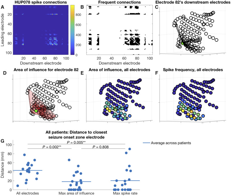
Electrode area of influence and distance between electrodes of interest and nearest seizure onset zone. (A–F) An example for Patient HUP078, and (G) aggregate data for all patients. (A) Matrix of downstream connections. For each electrode represented by a row i in the matrix, the colour in each column j represents the number of times the electrode j appears downstream in spike sequences led by the electrode i. (B) Connections from the matrix shown in A occurring more frequently than expected by chance (shown in black). (C) Locations of the electrodes that appear downstream in spike sequences led by the green electrode (electrode 82, chosen for display arbitrarily) more often than expected by chance. Each arrow connects the green electrode to one of its downstream electrodes. (D) The area of influence for the green electrode (electrode 82), which is the area connecting the green electrode with its downstream electrodes (the pink shaded area). (E and F) Area of influence and spike frequency for all electrodes, respectively. Yellow colours indicate higher values. (G) Distance from various electrodes of interest to their nearest seizure onset zone electrodes. Left: Cluster of points demonstrates, for each patient, the average distance from every electrode to its nearest seizure onset zone electrode. Middle: Cluster demonstrates the distance for each patient from the electrode with the highest area of influence to its nearest seizure onset zone electrode. Right: Cluster demonstrates the distance for each patient from the electrode with the maximum sequence frequency to its nearest seizure onset zone electrode. Horizontal lines show the average for each cluster across patients. The P-values are the result of Wilcoxon signed-rank tests comparing the distances for each group.

