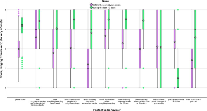
FIGURE 2.

Boxplots of the protective behaviour scores, before the coronavirus crisis (violet) and during the last 10 days (green). Note: Boxplots represent first to third quartiles. Means are represented by a diamond shape, medians by a straight line.
