Figure 4.

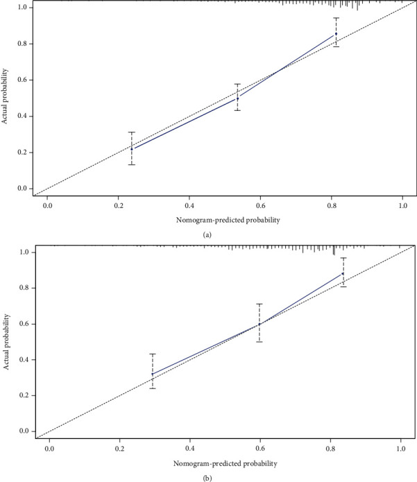
Calibration plots of the nomogram. The shadow line represents the perfect prediction of an ideal model, and the dashed lines represent the performance of the derivation cohort (a) and the validation cohort (b).

Calibration plots of the nomogram. The shadow line represents the perfect prediction of an ideal model, and the dashed lines represent the performance of the derivation cohort (a) and the validation cohort (b).