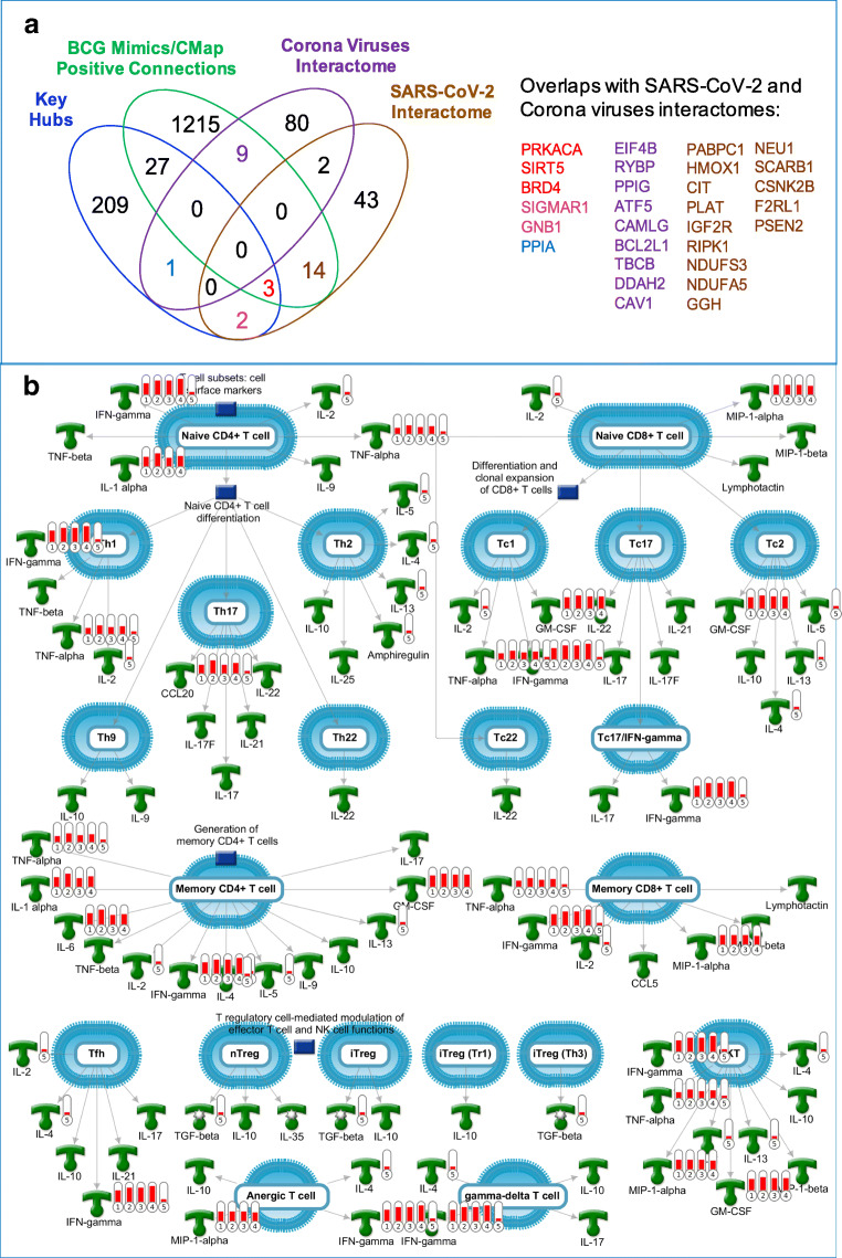
Fig. 4.
(a) A venn diagram showing overlaps between BCG genetic mimics and key hubs with SARS-CoV-2 and Corona viruses interactomes. (b) Top “pathway map” with the highest level of enrichment by genes in BCG-CGS. This map is generated using MetaCore from Clarivate Analytics. Red thermometers indicate genes overexpressed in response to BCG treatment, and the hight of the red bars is representative of the differential gene expression level (i.e., log2 values of the fold change). The numbers under the thermometers 1–5 refer to the experiment number: 1) gene expression on day 0 in response to BCG vaccination to a BCG-naïve population on day 1; 2) gene expression on day 0 in response to BCG re-vaccination to a previously vaccinated population; 3) gene expression on day 14 in response to BCG vaccination to a BCG-naïve population; 4) gene expression on day 14 in response to BCG re-vaccination to a previously vaccinated population, and 5) positive connections from the connectivity map, and the red bar in the thermometer number 5 represents presence of the gene only.

