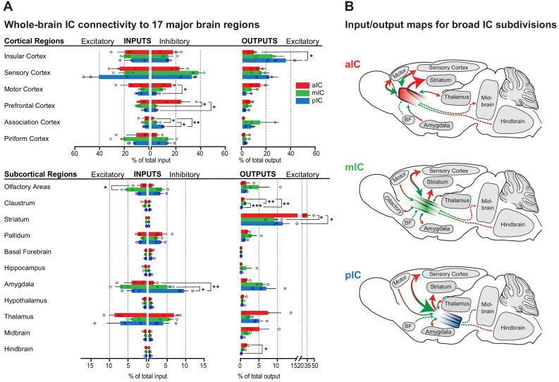
Figure 2. Whole-brain IC connectivity map.
(A) Comparison of inputs to excitatory and inhibitory IC neurons (left) and outputs of excitatory neurons of the IC (right) of all three IC subregions (aIC, red; mIC, green; pIC, blue) across the 17 major brain regions that displayed connectivity. Region values are given as percentage of total cells (RV) or of total pixels (AAV). Data is shown as average ± SEM. n = 3 mice per condition. Top panel shows cortical connectivity, bottom panel shows subcortical connectivity. One-way ANOVAs per subregion followed by Tuckey’s multiple comparison test were performed to generate p-values. Significant differences between inputs to excitatory or inhibitory neurons to IC subregions or between outputs from the IC subregions were labeled as ***p<0.001, **p<0.01, *p<0.05. For detailed statistics see Supplementary file 3. (B) Individual input-output maps for the three IC subdivisons highlighting selected brain regions. Weight of arrowhead and thickness of arrow shaft indicate strength of connection. Green arrowheads indicate inputs, red arrowheads indicate outputs.
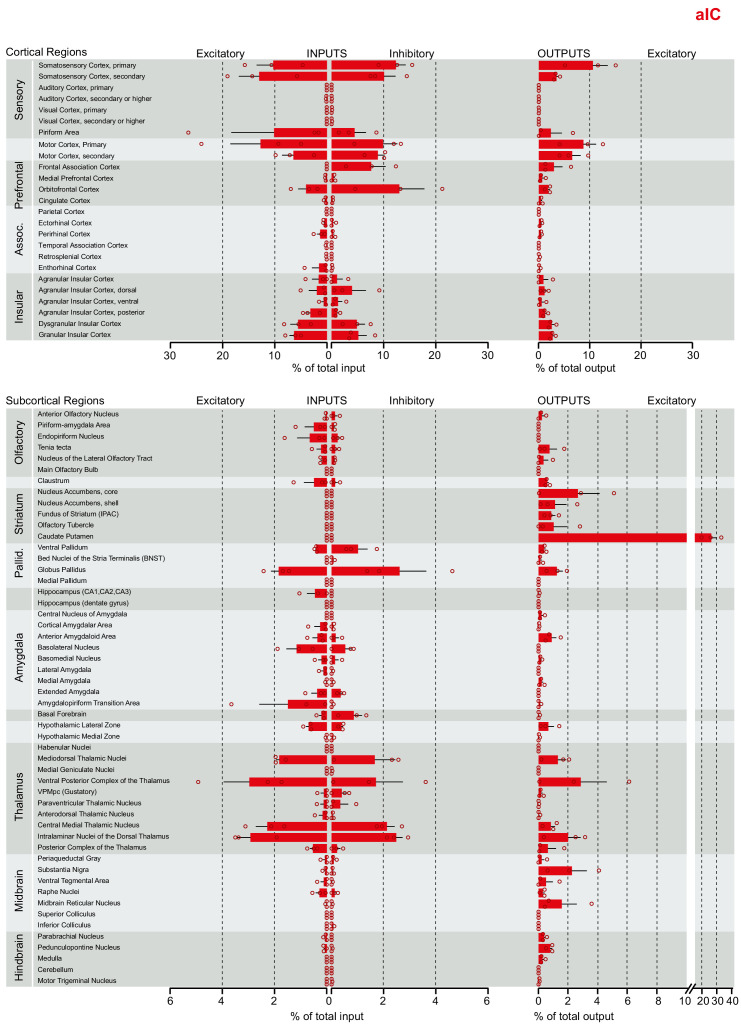
Figure 2—figure supplement 1. Brain-wide dataset for aIC.
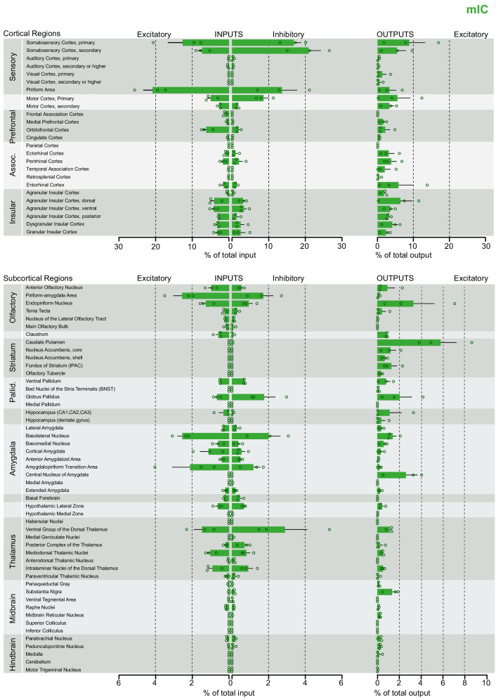
Figure 2—figure supplement 2. Brain-wide dataset for mIC.
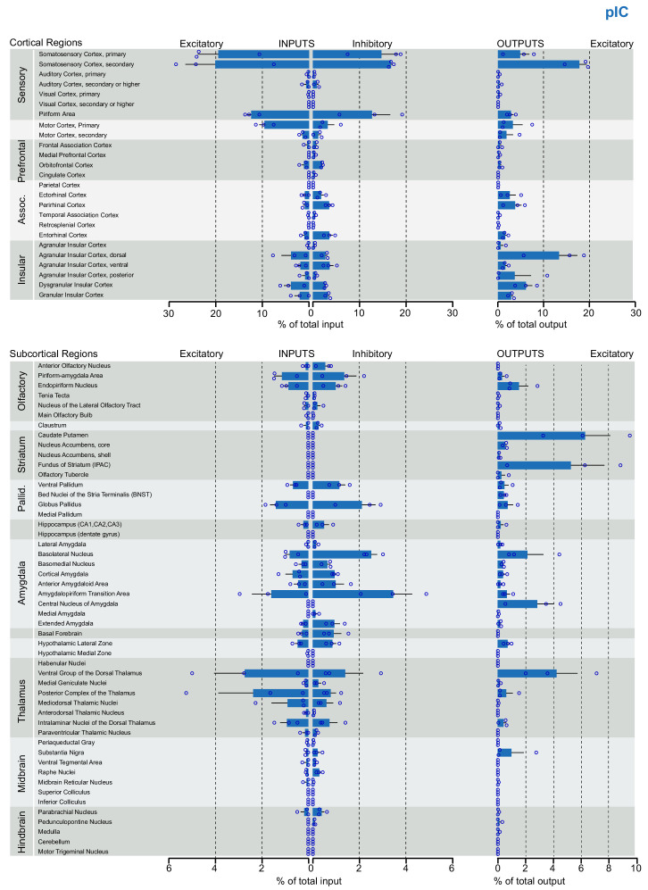
Figure 2—figure supplement 3. Brain-wide dataset for pIC.
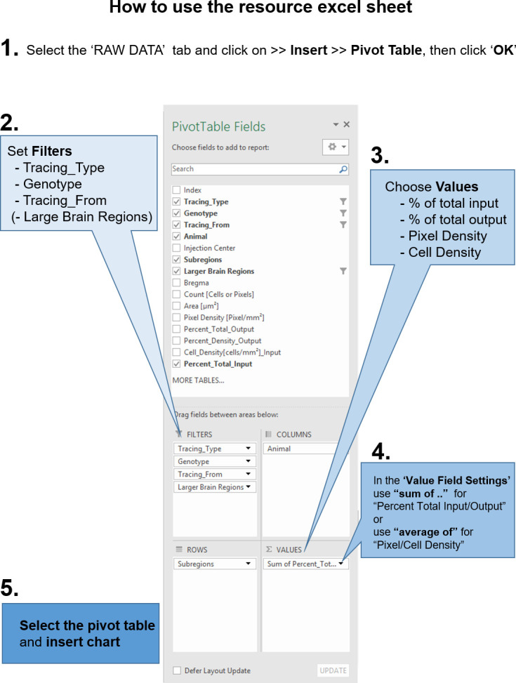
Figure 2—figure supplement 4. Instructions to query the datasets with custom questions.
