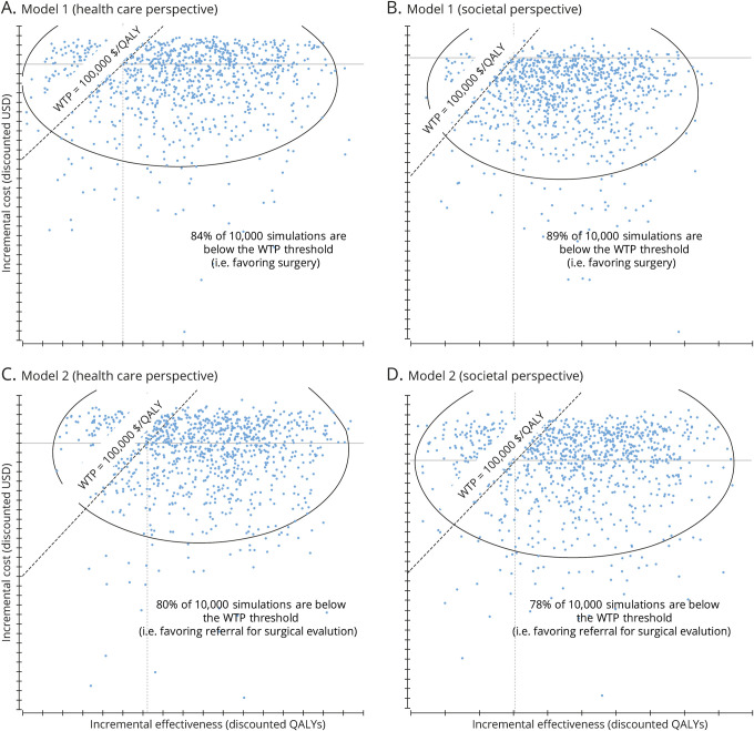
Figure 3. Results of probabilistic sensitivity analysis.
Scatterplots (A–D) show the results of 10,000 Monte Carlo simulations (probabilistic sensitivity analysis) of the decision-analytic models. Each blue dot represents the results of an individual simulation. Whenever a dot falls to the right of (below) the willingness to pay (WTP) line, the model would find surgery (model 1) or referral for surgical evaluation (model 2) to be cost-effective. QALY = quality-adjusted life-year; USD = US dollars.

