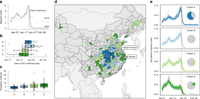
Fig. 1. Travel patterns between Wuhan and other connected prefectures.
The identified patterns of outbound travel from Wuhan: (a) the daily total outbound travel from Wuhan in 2019 and 2020; (b) timing of first case detection stratified by clusters of similar time series; (c) distribution of resident population sizes of individual prefectures (points); (d) map of prefectures and province-level cities showing the spatial distribution of timeseries clusters; (e) outbound travel trends from Wuhan to the most connected prefectures in China, stratified by clusters with similar time series. The clusters are defined by k-means clustering of the timeseries of outbound travel volume (see “Methods” section). For clusters in panels b and c, n = 22 (Cluster A), 34 (Cluster B) 33 (Cluster C), 36 (Cluster D). Boxplots in panels b and c display Median, IQR, and whiskers +/− 1.5 times IQR. The timeseries have been normalised by the total flow of each, to allow comparison of the profile. Inset pie charts show the total travel flux out of Wuhan prefecture by destinations in each cluster. The red dashed lines in panels a, b and e mark the beginning of LNY holidays. The colours in panels b, c, d and e indicate cluster membership (Cluster A, B, C or D).

