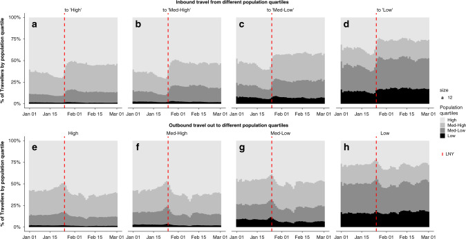
Fig. 2. Contribution of each population quartile to inbound and outbound travel.
Shading marks the population quartile with highest population quartiles in the lightest shade. The red dashed line shows the first day of LNY (25th January 2020). The figure displays the proportion of travel from all quartiles to High (a), Medium-high (b), Medium-low (c) and Low (d) population quartiles, as well as the proportion of travel to all quartiles originating from High (e), Medium-high (f), Medium-low (g) and Low (h) population quartiles.

