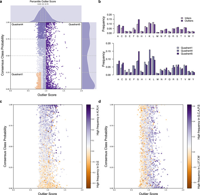
Figure 7.
Scatterplots showing the distribution of 5000 generated inliers sequences GIS according to outlier scores and hemolytic (HemoPI-1) consensus class probabilities. (a) Changes in the outlier scores and probabilities are illustrated with different shades of purples. Selected 507 non-hemolytic generated sequences with lowest outlier scores and hemolytic predictions (golden circles, quadrant 1). Generated sequences with highest haemolytic predictions are in quadrant 4. Generated sequences identified as outliers according to HemoPI-1 Average KNN (darkest purple data points, quadrant 5). (b) Differences in amino acid composition between the 3 quadrants 1/4/5. (c) Changes in colour gradient indicate differential enrichment in positively charged amino acids i.e. lysine, arginine, histidine (purple) or negatively charged amino acids i.e. aspartic and glutamic acids (orange). (d) Changes in colour gradient indicate differential enrichment in small amino acids i.e. glycine, cysteine, alanine, proline, serine (purple) or bulky aromatic/aliphatic amino acids i.e. phenylalanine, tyrosine, tryptophan, leucine, isoleucine (orange).

