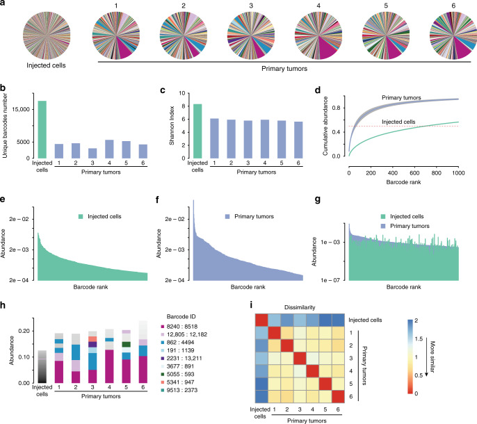
Fig. 2. Independent primary tumors have similar clonal composition.
a Pie charts showing the relative frequency of barcodes in the starting cell population and six independent primary tumors. Note that individual barcodes are represented by the same color in each pie chart. b Number of unique barcodes detected in the starting cell population and six independent primary tumors. n = 1 for the injected cell population and n = 6 biologically independent primary tumors. c Shannon diversity index showing barcode complexity of the starting cell population and six independent primary tumors. n = 1 for the injected cell population and n = 6 biologically independent primary tumors. d Cumulative abundance plots for the starting cell population and the average of six primary tumors, demonstrating that barcode complexity decreases during primary tumor growth. e Barcode abundance in the starting cell population. Barcodes are ranked on the x-axis from most to least abundant. f Barcode abundance in a representative primary tumor. Barcodes are ranked on the x-axis from most to least abundant. g Comparison of barcode distribution in the starting cell population and a representative tumor, showing that the most abundant barcodes in tumors were not abundant in the starting population. Barcodes are ranked on the x-axis based on their abundance in the primary tumor. h A subset of barcodes is reproducibly enriched in independent primary tumors. The most abundant barcodes in each sample are shown, with each color denoting a unique barcode. Note that barcode colors match pie charts in a. n = 1 for the injected cell population and n = 6 biologically independent primary tumors. i Correlation matrix showing the similarity in barcode abundance between samples. Primary tumors had similar barcode distributions to one another, but were distinct from the starting population. The Jensen–Shannon divergence was used to measure dissimilarity among tumors.

