
Figure 7.
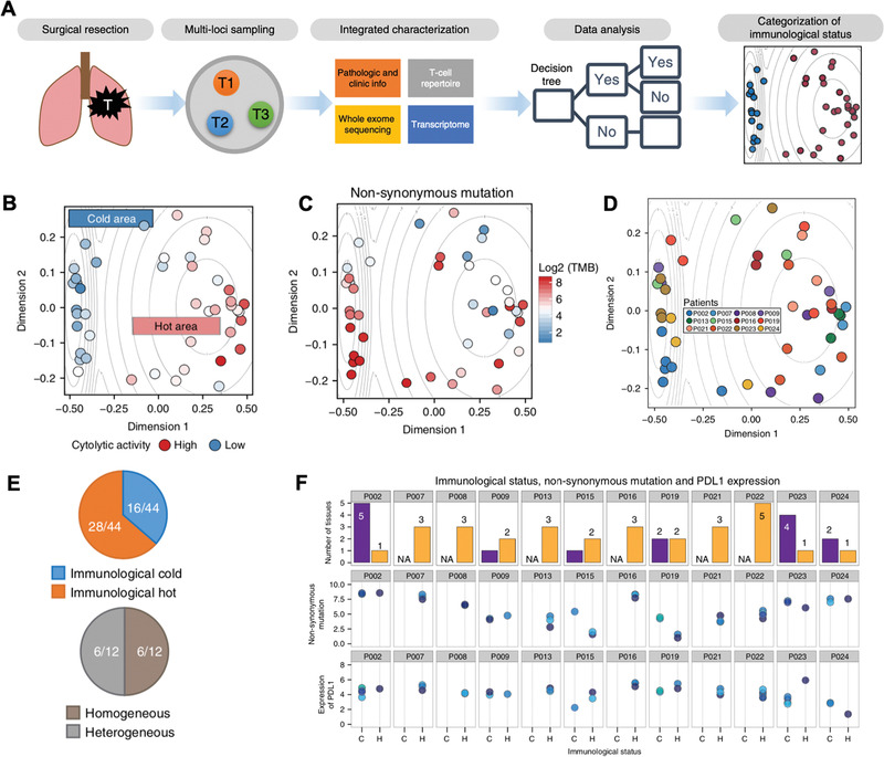
Machine learning for screening cancer immunotherapy. A) Schematic of applying machine learning on sequencing data gained from surgical biopsies of NSCLC patients. B) 2D visualization of an “immune map” showing immunologically “hot” (right) and “cold” (left) area from machine learning of multidimensional matrix of the input variables from NSCLC patients. Color indicates cytolytic activity. C) TMB was represented in the “immune map.” D) Location in the “immune map” of samples from different NSCLC patients represented as different colors. E) Pie chart (upper) displays proportion of immunologically “hot” and “cold” samples from all analyzed samples. Pie chart (lower) displays proportion of patients with different immunological status (heterogenous) and with one immunological status (homogenous). F) Immunological status, TMB, and PD‐L1 expression is categorized for each patient from top to bottom panel. The color in the middle and lower panel represent each individual patient. Reproduced with permission.[ 69 ] Copyright 2018, Nature Publishing Group.