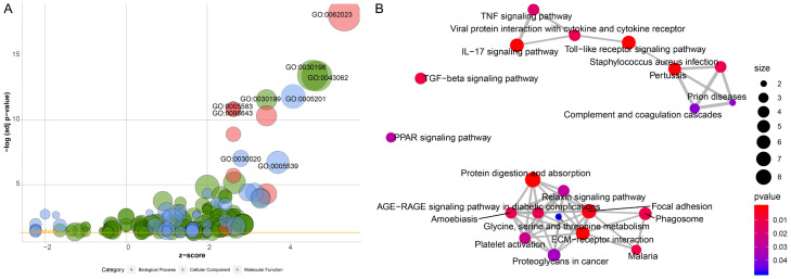
Figure 2.
A. Bubble plot of enriched GO terms. The x-axis represents the z fraction, and the y-axis represents the negative logarithm of the p-value. The higher the location of the bubble in the graph, the more significant the difference. The circle size represents the number of genes assigned to the corresponding term. Green circles correspond to biological processes, red circles to cellular components, and blue circles to molecular function categories; B. Pathway analysis of differentially expressed DEGs. Red circles indicate the number of differentially expressed IRGs in each pathway. Lines between the two red circles represent the ratio of differentially expressed IRGs to the commonly expressed genes in the two pathways; the thicker the line, higher the ratio of the differentially expressed IRGs.

