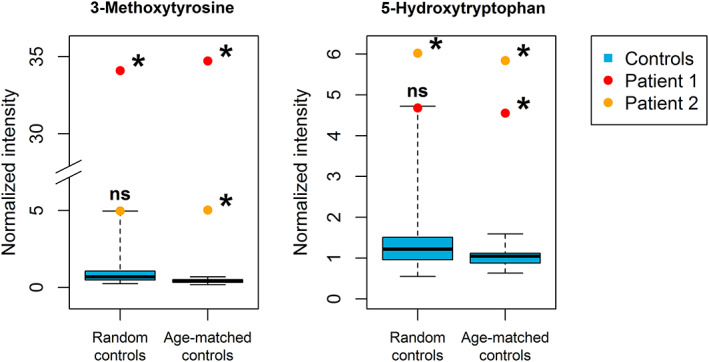
FIGURE 2.

Analysis of 3‐methoxytyrosine and 5‐hydroxytryptophan in AADC deficiency patients compared to random and age‐matched controls. Boxplots (blue) represent data from control samples. Boxes show median and second and third quartiles of the control group. Whiskers extend to minimum and maximum values. Patient samples are individually plotted as points (red/orange). * = Bonferroni Holm‐corrected P‐value < .05 (when comparing the single patient to the controls), ns = not significant (P ≥ .05). The figure shows the relevance of working with age‐matched controls
