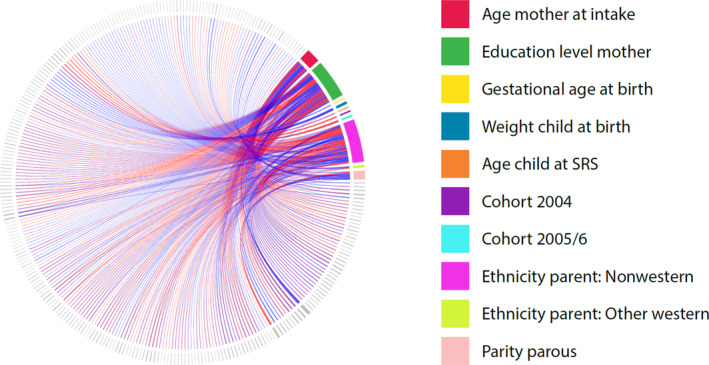
Figure 3.

Plot demonstrating the high covariance structure between the different variables used in the analyses. As there were too many variables to list all in the figure, the purpose is to show the high correlation between multiple variables in the EnWAS. Red indicates a positive correlation whereas blue indicates a negative correlation. The legend reflects the different covariates used in the study.
