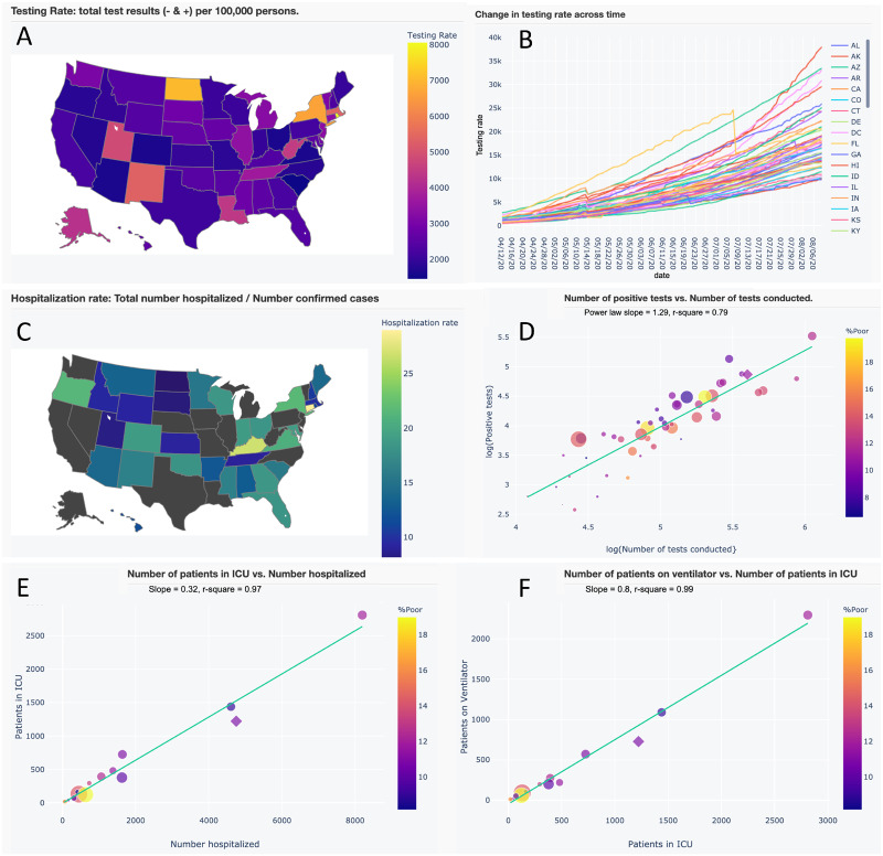
Figure 3.
A subset of interactive maps and statistical relationships from our application’s Trends in Hospitalization and Trend in Testing tabs. Users can pan across, zoom in, select and de-select data, and hover over data for additional information. (A) Map of testing rate (tests per 100 000 persons). (B) Time series of testing rates across US states and territories. (C) Map of hospitalization rate (total number of persons hospitalized/no. of confirmed cases). (D) A strong power-law (y ∼ xz) relationship between positive test results and number of tests conducted, where the slope (z) indicates that greater testing reveals disproportionately greater positive results. (E and F) Strong linear relationships between the number of patients in intensive care unit (ICU) versus the number hospitalized and the number of patients on ventilators versus those in ICU. These latter relationships may be used to aid in parameterizing forecast variables.

